UX design (as with all disciplines) is full of ‘rules’. These set a standard that designers can follow to ensure that their UX is both current and efficient. Rules eventually become outdated and new ones will appear to replace them.
Rules can be helpful, but ultimately, I prefer to call them guidelines as a designer should always consider their specific situation before making decisions. The best designers are ones who breaks rules. If we never broke rules, we wouldn’t have innovation.

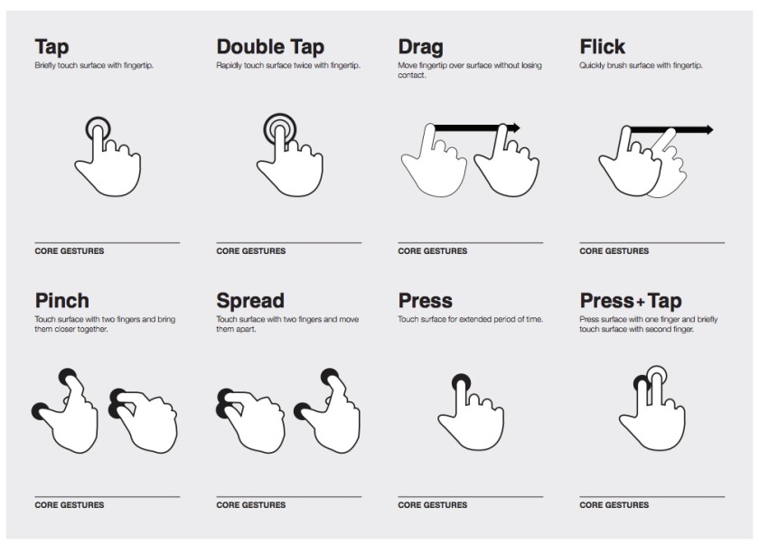
There’s a UX ‘rule’ called the 3-click rule that states if anything takes more than three clicks (or gestures for touchscreens), it’s considered bad UX; therefore, designers should create the navigation and site architecture so that users can access whatever they need in 3 clicks or less. Supporters of the rule argue that more clicks means more opportunities for a user to get frustrated and leave the website, every click reduces the chance that someone will buy the product, and there is a huge user drop off after 3 clicks.
When someone mentions clicks (particularly, this rule), UX designers will crawl out of the woodworks to debate them. The majority of UX designers argue that the 3-click rule is laughably outdated. This shouldn’t be an argument. As a rule, it definitely is. If a user navigates off of the website after 3 clicks, it usually isn’t due to the number of clicks; it’s because the UX designer failed.
“The 3-click-rule is the Freddy Kreuger of web design advice. You think it’s finally dead and then it comes back and starts slashing up sensible debate about usable design. I’m hoping to convince you to stop talking about the 3-click rule. I don’t mean substituting it with the 4-click rule or the 5-click rule. You should stop counting clicks as a measure of usability altogether.” — Stop Counting Clicks by David Hamill
While I agree with much of this article, I don’t believe a UX designer should stop counting clicks altogether. It definitely shouldn’t be the main factor guiding design decisions, but it’s still something a UX designer should consider; there’s no reason to make things long and convoluted when they don’t need to be.
Although the number of clicks ultimately doesn’t matter, it can be an indicator of poor UX. It’s not uncommon to hear designers say, “No, this is two clicks, you can make it one.” Sometimes content shouldn’t even require a single click or gesture. Being frustrated that something takes two clicks when it should be zero is a legitimate complaint from a design and business standpoint.
There are exceptions to every ‘rule’ of design and the 3-click rule has so many that it’s ineffective as a rule. As a UX designer, I often find myself debating number of clicks with developers and other designers. I stipulate that more clicks are perfectly fine as long as the user is confident the click will lead them where they want or the user feels like they’re making progress in a way that feels intuitive. It’s all about removing doubt and hesitation.
A couple of examples: Sometimes you can improve the UX of completing a process-based task if its divided into separate sections rather than one long section with a worse UI. An online store that changes from 3 clicks to 4 clicks is most likely doing so because they are adding categories. This increases sales because it’s easier for the user to find exactly what they want.
It can still help if the user doesn’t have a clear idea of what they want. A user could be looking for gardening tools on Amazon without a specific tool in mind, and as long as they see that their browsing seems to be leading them in the right direction — “Hey, now I’m looking at departments! Now I’m looking at Home and Garden! Now I’m looking at outdoor stuff! Oh, I do need shears!” — the user is going to be satisfied.
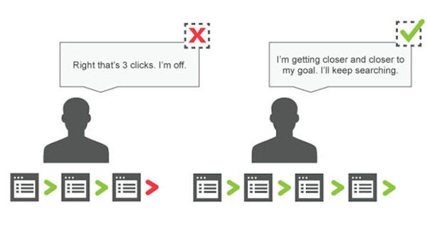
We satisfice by just choosing the first thing that makes sense even if we’re not sure where it will take us. Having to click back occasionally isn’t terrible as long as the user feels like they’re getting closer to what they want — “Whoops, I don’t want outdoor furniture.”
Some argue that more clicks is fine the first time, but becomes annoying if you need to go through all of those clicks every time. If multiple clicks works well the first time but would be annoying after that, it’s a UX designer’s job to modify the experience for the second time.
In checkout experiences, if the user has to log in, go through multiple pages to find a product they previously looked at, and fill out all of their shipping and payment information every time, they would reasonably be frustrated. This is why there are ‘viewed recently’ sections and the option to save account information. With saved accounts, if the user want to pay a bill, they can go to the site, click pay bill, maybe put in a security code, and click submit. For tasks that will be repeated, the process should be streamlined after the first time through.
Additionally, some people navigate a site ‘incorrectly,’ meaning that they take more clicks to get to something when it’s possible to get there with fewer or one click. However, they are comfortable with this. It doesn’t negatively impact their experience because they are confident of where they are going. They got there using a roundabout way once, so now they are able to do it very quickly. It becomes habit, and the outcome is worth the extra seconds.
‘Incorrect use’ usually applies to people with differences in tech knowledge. Those familiar with technology may not even realize how quickly they are able to see common web conventions. A tech-savy user may be able to see the quickest way to get somewhere whereas those who are not tech-savy cannot. This is demonstrated often between children and parents.
An extreme (but humorous) example is how my mother googles ‘google’ to get to google. She types “google” in the search bar, is redirected to google listing articles about google, and then clicks the first one to ‘get to google’. I have explained that she can type her search in the search bar and it’s the same thing, but she never does. It’s a habit that she is comfortable with and she likes the assurance of seeing Google’s homepage. She also uses full sentences when googling, but that’s another story.
When you’re designing a site that will be used by audiences with varying levels of tech experience and someone behaves in an unexpected or ‘incorrect’ manner, it is never the user’s fault, but it also isn’t always due to bad UI. If they get where they want and are happy, why fix something that isn’t broken?
At some point, a designer decided to challenge the 3-click rule. They broke the rules and the web became a better place for it. The only consistent rule of design is that there are no rules, so go innovate.
If you would like to learn more about clicks or UX in general, I strongly suggest starting with “Don’t Make Me Think” by Steve Krug.
